

Buffer is one of the most popular social media management tools used today. Originally one of the easiest tools to use for queuing posts for social networks. Buffer has evolved into three tools. Buffer Publish for queuing posts to your social accounts. Buffer Reply, for managing social customer service and community engagement online. Buffer also recently added Buffer Analyze for more in-depth analysis and reporting.
Buffer Publish has always had a simple, easy to use interface, but the user experience has not been updated in years and was starting to show its age. Buffer has started rolling out a new user experience that simplifies and streamlines publication tasks. They’re letting some users give it a try. If you use Buffer you might see a popup like this:

In this article, we’ll take a first look at Buffer’s new streamlined user experience.
Buffer Queue
If you’re using Buffer, you might get a popup, or a banner prompting you to try the new view, or you can go to My Account in Publish and choose to try it:

The “classic” Buffer Publish queue has looked like the following for a while:

Buffer Publish Classic UX
The new, streamlined interface removes unnecessary clutter, lines, and separators, and makes objects and controls bigger, and easier to find.

Buffer Publish New UX
Gone are tabs for Content, Analytics, Approvals, Drafts, and Settings all replaced by a simpler set of links. Also gone are channel and post icons, giving each post more space in the UI. Posts also scale more, taking better advantage of the desktop real estate. All post edits (including rescheduling) go through the Edit button. This is good as performing simple edits to a post or copying post text no longer opens a new dialog which then has to be closed. Throughout, from scroll bars to dividers, lines are removed or reduced and shading differences are minimized. The changes give the new UI a less cluttered, less stressful feel and make it more appealing.
Here are the classic and new queues without markups:

Buffer Publish Queues Classic

Buffer Publish Queues New
Calendar Views Get More Space
Buffer’s weekly and monthly calendar views in the new UI are similar to classic except that the profile list and tool controls have been removed and replaced by a single Back to Buffer Dashboard button in the upper right. This lets the calendar take the entire screen and gives you more real estate to work with posts on the calendar.

Buffer Weekly Content Calendar

Buffer Monthly Content Calendar
Buffer Analytics Gets a Facelift
With a Pro or better subscription you get Buffer’s very good advanced analytics. Buffer’s post analytics have the same user experience updates offering a larger view of posts, the simpler, less cluttered look and easy buttons for resharing content.
Many features have moved or changed slightly. This is due to Buffer’s recent early look release of their advanced analytics tool, Buffer Analyze. We have a full, first look review of Buffer Analyze here. In fact, if you use analytics a lot, it may take you some time to find some of your favorite features.
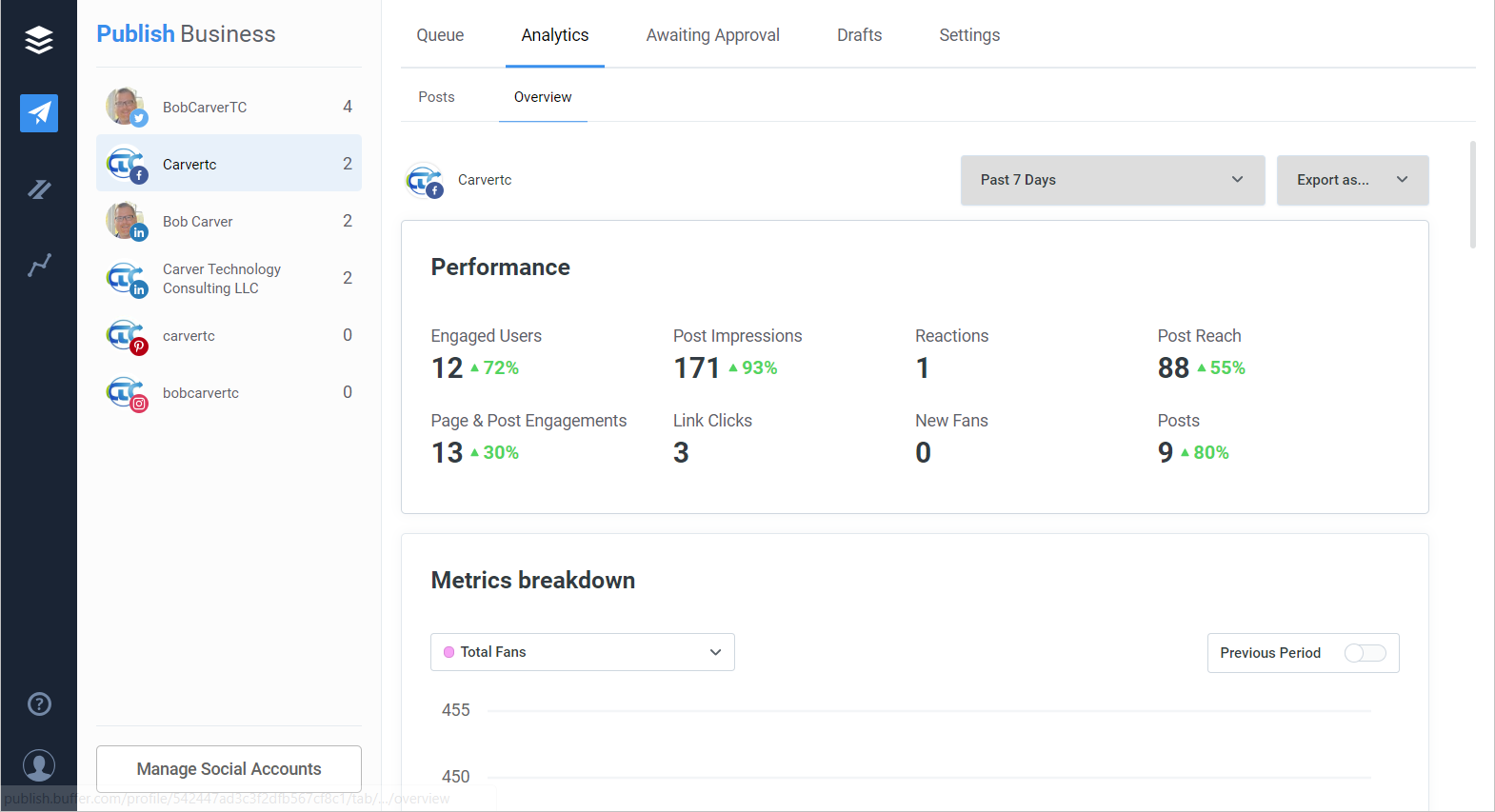
Buffer Analytics: Facebook Performance

Buffer Analytics: Twitter Hourly Engagements
Post analytics, however, were hard to find. In the classic UI, post filtering options for finding your best content to reshare, and your worst content to never repeat again were the first thing at the top of the Analytics page. In the new UI, recent posts are still shown first to provide a quick overview of what’s been shared recently.

Buffer Analytics: Posts
More robust post filtering and sorting options are now in Overview, under Post or Tweet Breakdown.

Buffer Analytics: Tweet Breakdown
Performance is much better
If you use Buffer daily, as I do, you notice some lag when switching channels, opening posts, and performing other activities. No worse than Hootsuite, HubSpot or other tools we work with. I noticed right away, however, that the new Buffer UI was much snappier. Switching between activities seems to take far less time in the new UI. I don’t know if that’s because of programmatic efficiencies or if the new UI is running off of different servers and doesn’t have the same usage profile as the classic UI. Time will tell on that.
They’ve done a good job
The UI and UX people at Buffer have done a good job. They’ve taken an already very good UI and make it simpler, less cluttered, nicer to look at and work with, while retaining the ease of use that Buffer is known for. If you use Buffer or are interested in trying it, I suggest giving the new user experience a try.
